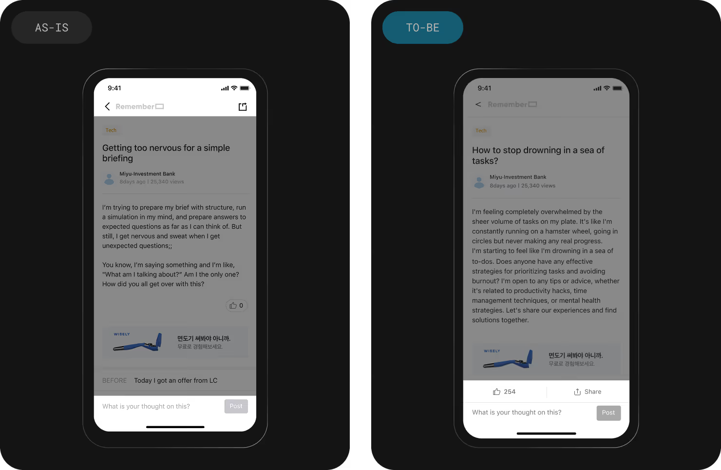
As more professionals share their thoughts and know-how on work and life in Community, insightful posts and comments started to attract attention. Users wanted to share them but the current Share function was not sufficient for their needs. Only 0.5% of users who read a post clicked Share button, and 5% of those who clicked the shared links reached the shared posts.
Multiple iterations of design were developed in the process to find the appropriate layout and style that can accommodate all the above solutions.
‘Share’ is now easier to identify and use, allowing users to share more. The percentage of users sharing a post after reading one increased by 1.9x.
With the integration of engagement actions into one component, Likes per post increased by 1.7x as well.
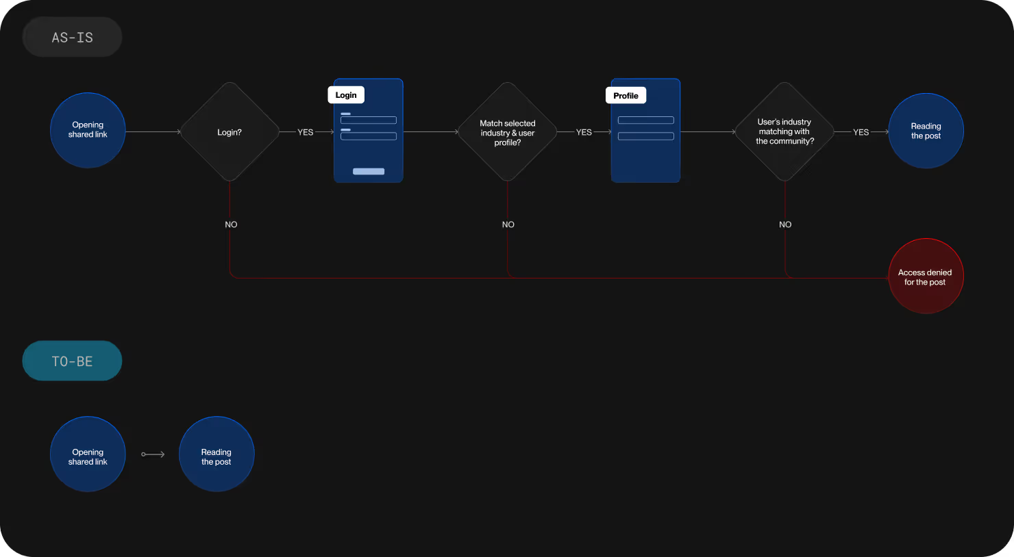
The fact that the user cannot access the shared post with one click provokes negative feelings from the beginning of their experience with Remember Community. Shared posts are exceptionally valuable as the Community members are voluntarily spreading the words for the Community, and its experience has to be easy and smooth.
Community’s policy focused on bringing in more users from the shared posts by asking visitors to sign up right away. However, such a policy and long sign-up process prohibited easy access to the shared pages and a lot of visitors gave up before actually reading the posts. The team decided to switch gears to focus on spreading the knowledge and insights to promote the Community’s value. As people read more insightful posts from the Community, they will get interested in Remember Community, and will naturally join as new users.
The new user conversion funnel of shared links, which created a negative impression for new visitors who are meeting Remember Community for the first time, was improved. Those who have not known the Community can access the posts without any friction so that they can glimpse into the service. The checkpoint for new user sign up has been moved to the latter part when they try to hit Likes or leave comments. Asking visitors to sign up when they want to interact with the Community makes their experience more natural.
As soon as the team decided that we needed Share function, we put the Share button quickly at the corner of the screen without sophisticated development. Such action allowed us to gather data on which we could build hypothesis and design strategy, eventually improving user experience. Such rapid execution and learning that followed guided the team toward the right direction. We could put our resources and energy to focus on the key problems.
From the beginning of design process, I shared my design ideas and plans with developers. Through discussion with developers and project manager on user experience, timeline, workload, and other diverse aspects of the projects, I could make the best design decisions. Sharing how the project is being designed with the team enabled everyone to align on the task that we were working on, and enabled myself to design just as much as it was needed.